On super mini menu bars & minimalism in design
How the Supernotes attempt at minimalism made me long for an Amazing Marvin experience.
Abstract Tomatoes rating: 🪨 8% (Concrete)
I talk about details of Supernotes and Amazing Marvin, but I do touch on the kind of abstract topic of minimalism in design, so dock concreteness points for that.
Red Tomatoes rating: 🍅 84% (Red)
SMMB’s are an experience we can take design inspiration from today—this pattern is ready to go!
The other day, I was patrolling the web, looking for new interfaces to try (as one does for fun). Endlessly fascinated by note-taking and knowledge management tools, I decided to try out Supernotes, a note-taking app based on the concept of “each note is a card that you can organize in differenys”.
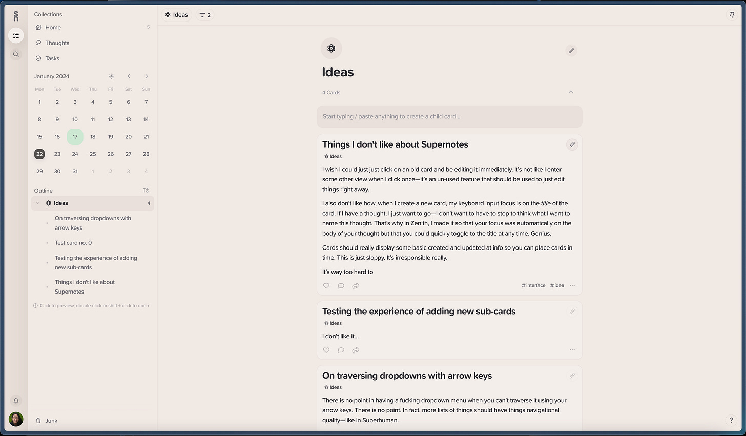
Despite going in bright-eyed and bushy-tailed, I just didn’t like it. For many reasons, some captured in the scrawled out notes in the image above—which were strangely painful to create, by the way. But these are all small reasons compared to the one big reason Supernotes bothered me so much: it is a bad interpretation of the concept of minimalism.
Minimalism in Supernotes
As I was learning the Supernotes interface, I was constantly frustrated by how many damn keystrokes and clicks and cursor moves I had to make to get frequently-occurring tasks done.
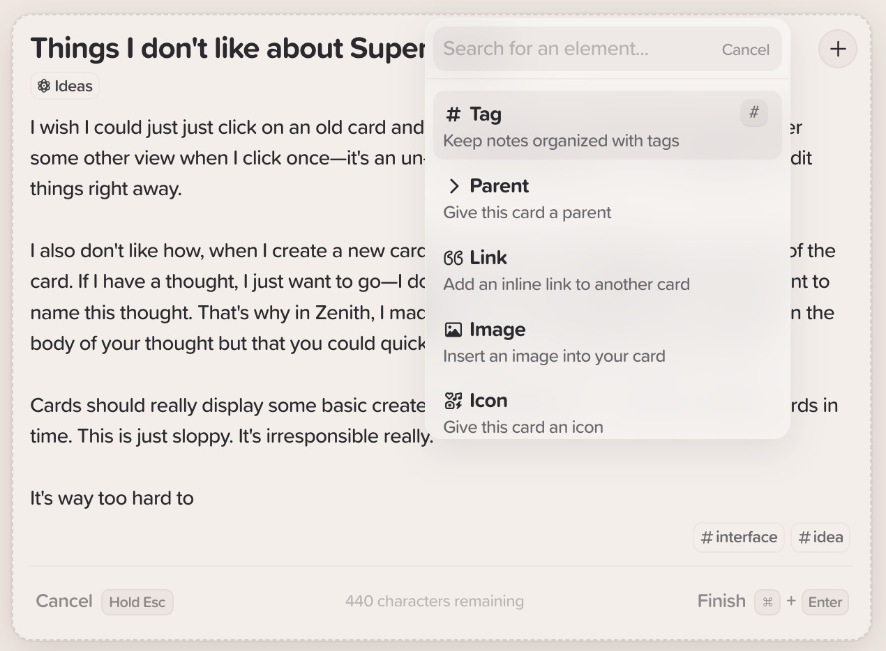
I’ll give you an example of this. When I want to tag a card, link it to another card, organize it, or do anything interesting with it besides just typing words (which is the whole point of these fancy note-taking apps), I have to:
Press
\.Then, I have to select the action I want to take (with my mouse, arrow keys + enter, or the indicated keyboard shortcut that I have to be focused on to see anyway and so might as well just hit Enter).
Then, I have to specify the details of that action before taking it.
It’s kind of ridiculous!
Supernotes seems to interpret the concept of minimalism as hiding functionality behind layers of the UI to keep things “simple”. This creates a simple visual experience, but my mental experience really gets thrown out of wack. I get disoriented, confused, and ultimately frustrated because I have to spend time and energy wading through the interface to find the simple action I want to take.
The visual design of Supernotes is pleasing and clean, but it means that you have to break through deeper layers of the interface to get to what you really want once start painting outside the lines a little bit.
Basically, I found Supernotes to exhibit a very, very frustrating type of design minimalism—it prioritizes visual simplicity over functional simplicity, and that doesn’t make for a good experience. Feels like candy-coated air to me.
Minimalism in Amazing Marvin
Sitting there in frustration with Supernotes’s unhelpfully minimalistic experience, I was struck by an appreciation for one of my most frequented interfaces: Amazing Marvin.
Now, I have a lot of issues with Marvin, perhaps some of which I’ll write about later. But there is one feature in Marvin that screams beautiful, functional minimalism to me: Super Mini Menu Bars, or SMMB for short (nota bene: not an official term, just something I made up).
Amazing Marvin is a personal task management (todo) app designed for power users (neurotic, controlling, obsessive 30-year-old’s in tech, for example). It’s based on the concept of “tasks you can organize and view in a shit ton of different ways”.
Something that sparks a lot of joy for me while I’m using Marvin: each task has this little menu bar associated with it (revealed on hover), and it is chock full of functionality. It’s a Super Mini Menu Bar!
Having so much power at your fingertips is cool to start, but what’s even cooler is that you can configure this menu bar to your liking, adding actions to what at least feels like no limit (I haven’t actually tested this empirically). When you hover over one of the simple icons, there’s an unobtrusive yet helpful tooltip that displays the name of the action the icon represents.
Think about how much functionality is packed into this little thing—I have eleven actions in my SMMB, all accessible with a simple hover and an interface just helpful enough so I can navigate them all with relative ease.
Some other notes of appreciation for Marvin’s SMMB feature:
You can create rules so different types of tasks have different actions in their SMMB’s… wow!
I think it’s very smart to have simple, system-style icons as opposed to emojis. They’re more legible and both visually and conceptually simple, and are thus probably easier to learn as a user.
Speaking of icons, have you ever seen custom icons done so well? I’m sick of the futuristic, minimalistic, line art squiggles that look more like tech startup logos than they do actually informative iconography. In the example pictured above, I see a calendar with an arrow pointing to the right, and I see the words “Push off one day”, and I immediately know what that button does and can easily recognize its meaning next time.
As with any good list experience, you can re-order the actions in your SMMB. You can even create visual dividers between groups of actions (though just using extra pixels between divided groups is the wrong design to me).
Super Mini Menu Bars like in Marvin demonstrate the kind of minimalism that I enjoy—they pack an outsized punch in terms of capabilities but in a functionally simple interface.
Afterword: Problems with SMMB’s in Amazing Marvin
Super Mini Menu Bars are powerful things, and despite the impressive power of the SMMB’s in Marvin, I don’t think the interface quite does them justice.
I polled some of my teammates who use Marvin, and a handful of them complained about their SMMB getting in the way when they wanted to click on the task to either edit the task name or move it.
Marvin’s SMMB’s also lose a lot of usability points because it’s kind of confusing to figure out how to configure the damn things. Not only functionally difficult (what do I click to do this?) but also mentally difficult (what actions do I actually want to take with my SMMB?). Designing your SMMB is hard to get right, let’s put it that way. I’m constantly tweaking my SMMB, and for me, the danger is that I overcomplicate things way too much (with great power comes great responsibility, they say). This ends up creating a less-than-ideal SMMB experience for myself in the end, which is… frustrating.
I also hate how much I have to use my trackpad—in Amazing Marvin in general, but especially when it comes to the SMMB feature. Why not give this feature a Superhuman-like, never-leave-your-keyboard experience? The fact that I have to use my trackpad to both invoke and execute actions in the Super Mini Menu Bar is a real shame. Improvements I’d make to really minimalize (not a word) this experience:
You should be able to have your focus on a single task in the task list and move that focus using your up-down arrow keys.
You should also be able to Shift-click between two tasks to select all the tasks between them and perform a bulk action on them.
You should also be able to Cmd-click arbitrary tasks to select them at once.
An aside: I’m going to guess this shortcut isn’t as commonly known. I learned it and use it a lot to select my favorite photo files from the external drive that carries all my raw photography and transfer them to my computer. It’s quite a handy shortcut whenever you want to apply a bulk action to items that the app thinks are unrelated because of the way the information is being organized. One common solution for this use case is the dreaded checkbox-checking selection mode, which I’ve come to hate: you have a list of things, and you have to go through the list and click the checkbox icon to select that item… such a terrible, tedious thing.
When you focus on a task, the Super Mini Menu Bar should appear, as it does now. You should be able to press
1…9(or0) to quickly take the corresponding action. Like with tabs in Chrome, if you have more than 10 actions in your SMMB, may God help you.At the very least, there should be a key command (maybe
A, for action?) that quickly toggles the SMMB out of view. There is surely a better solution to this, but we can start here while we all think about it.There should be a simple way to add and remove actions from the SMMB. Bonus points if you can edit their name or create smart actions easily. (I know I’m pointing out a problem without providing a solution with this one… my generativity lost steam here.)


"neurotic, controlling, obsessive 30-year-old’s in tech, for example" -- I feel like I'm being called out.
The icons in the SMMB almost remind me of the iconography in a well-designed board game like this one: https://m.media-amazon.com/images/I/818XEb63QaL._AC_UF894,1000_QL80_.jpg
If anyone reads this post and wonders how one actually edits the SMMB, you have to go to the "Hover Button Menu" in Features/Strategies.